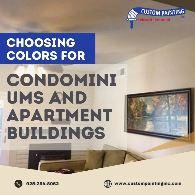
Color choice in condominium and apartment buildings is crucial for creating a welcoming atmosphere and a cohesive identity. Aesthetics and functionality work hand in hand in commercial painting to enhance visual appeal while ensuring durability.
Choosing colors that suit your property’s architectural design, decor, and other elements can be complicated. Professional painters can help guide your decisions by recommending the best materials and finishes balancing beauty with practicality to achieve attractive and long-lasting results.
Why does color choice matter?
Color choice is crucial in several aspects of property perception and presentation:
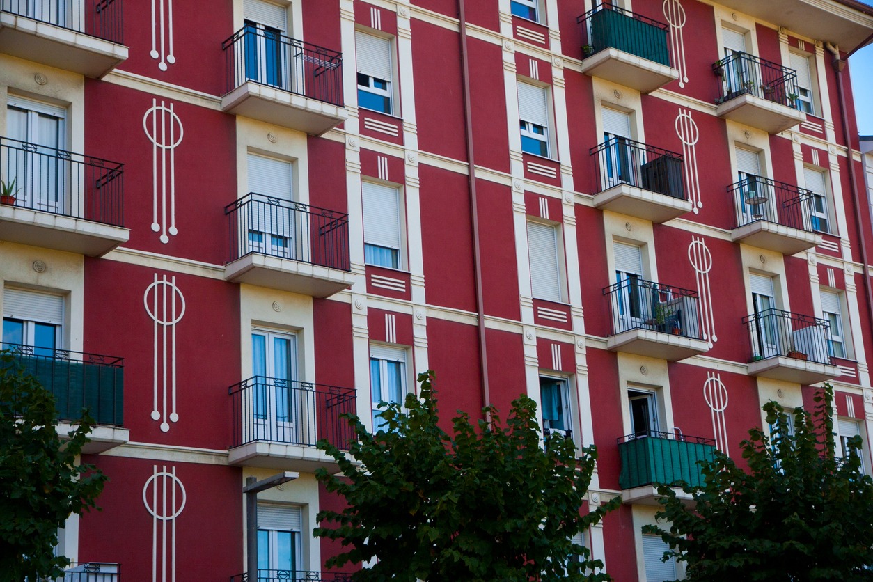
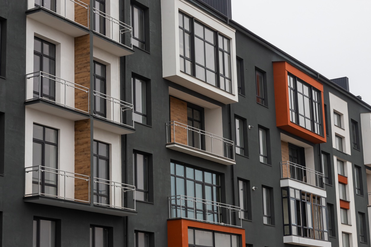
- First impressions: A building’s exterior color acts as its visual identity. It instantly influences how tenants, buyers, or visitors perceive the property. An appealing, well-chosen color can attract attention, create positive emotions, and increase interest.
- Property value: A suitable color scheme can enhance a property’s perceived value. Neutral, sophisticated, or on-trend colors make a property feel more valuable, while poor or outdated choices may diminish its appeal.
- Cohesion with surroundings: To maintain harmony, color needs to align with the neighborhood and the architectural style of the building. A color that clashes with its surroundings can feel out of place, while one that complements the environment enhances the overall aesthetic.
Practical considerations in color selection
When selecting colors for a space, such as an apartment or condominium, practical considerations are key:
Durability and maintenance
Lighter colors, such as whites and pastels, tend to show dirt, scuffs, and stains more easily, requiring frequent cleaning and maintenance. Darker colors, like deep blues or grays, are better at hiding dirt and wear, making them more suitable for high-traffic areas. However, dark shades can also reveal dust and fingerprints, especially on glossy finishes.
Climate impact
In hot climates, lighter shades reflect sunlight, keeping interiors cooler and making them more energy-efficient. Darker colors absorb heat, which can be beneficial in colder climates where warmth retention is needed, but they can increase cooling costs in warmer regions.
Long-term wear and fading
Colors exposed to the sun, like those on exterior walls or near large windows, can fade over time. Lighter colors generally fade less noticeably than darker or more vibrant hues. Finishes also matter—matte finishes tend to fade more quickly than semi-gloss or satin, which are more resistant to elements like rain, snow, or UV rays. Durable finishes are essential for maintaining the longevity of color in harsh climates.
Popular color schemes for condominiums and apartments
Every year, paint color preferences evolve. We’ve seen color trends come and go and then come back. When selecting color schemes for condominiums and apartments, striking a balance between timeless appeal, personality, and future adaptability is crucial.
Ask anyone about the trendiest paint colors at the moment. You are likely to get differences in opinions. However, these are our paint color scheme suggestions for apartments and condominiums:
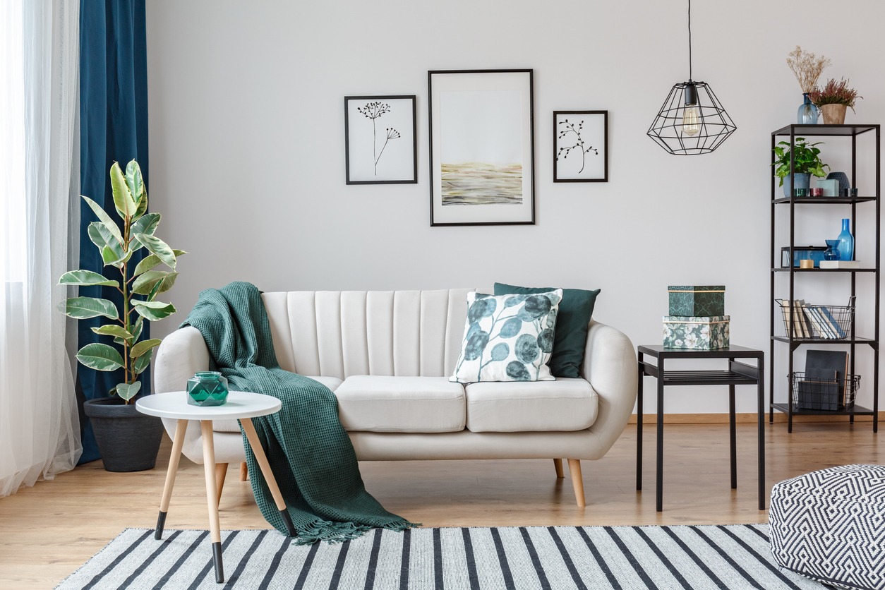
Neutral palettes (grays, beiges, whites)
Why neutrals remain popular:
- Timeless appeal: Neutral colors have been a favorite for their classic and sophisticated look. Shades like warm beiges, soft grays, and crisp whites create a clean, calming atmosphere that appeals to many people.
- Flexibility: Neutrals offer tremendous flexibility for future changes in décor or design. If a tenant or homeowner wants to change their furniture, artwork, or décor style, neutrals provide the perfect backdrop that adapts to various aesthetics without clashing.
- Brightening spaces: Lighter neutrals like white and off-white help make small apartments feel more spacious by reflecting light. It is a significant consideration in urban settings where natural light may be limited.
- Resale value: Neutral palettes have broad appeal and are more likely to attract future buyers or renters, making them a smart choice for those considering the long-term value of their property.
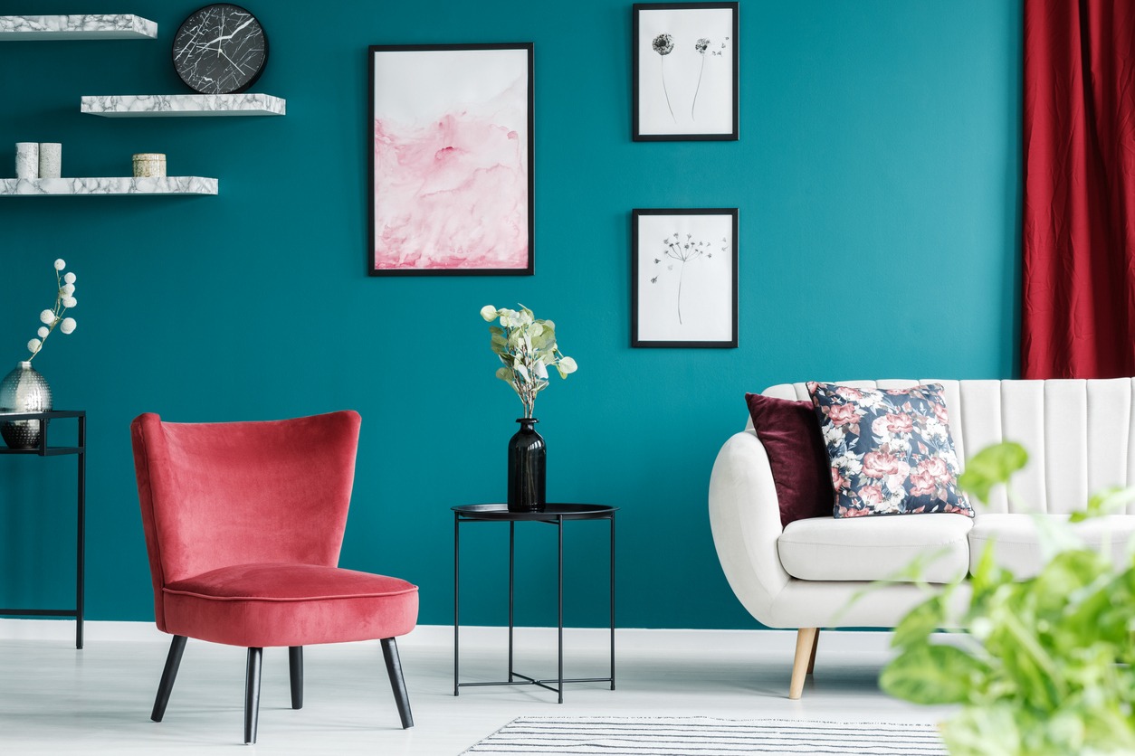
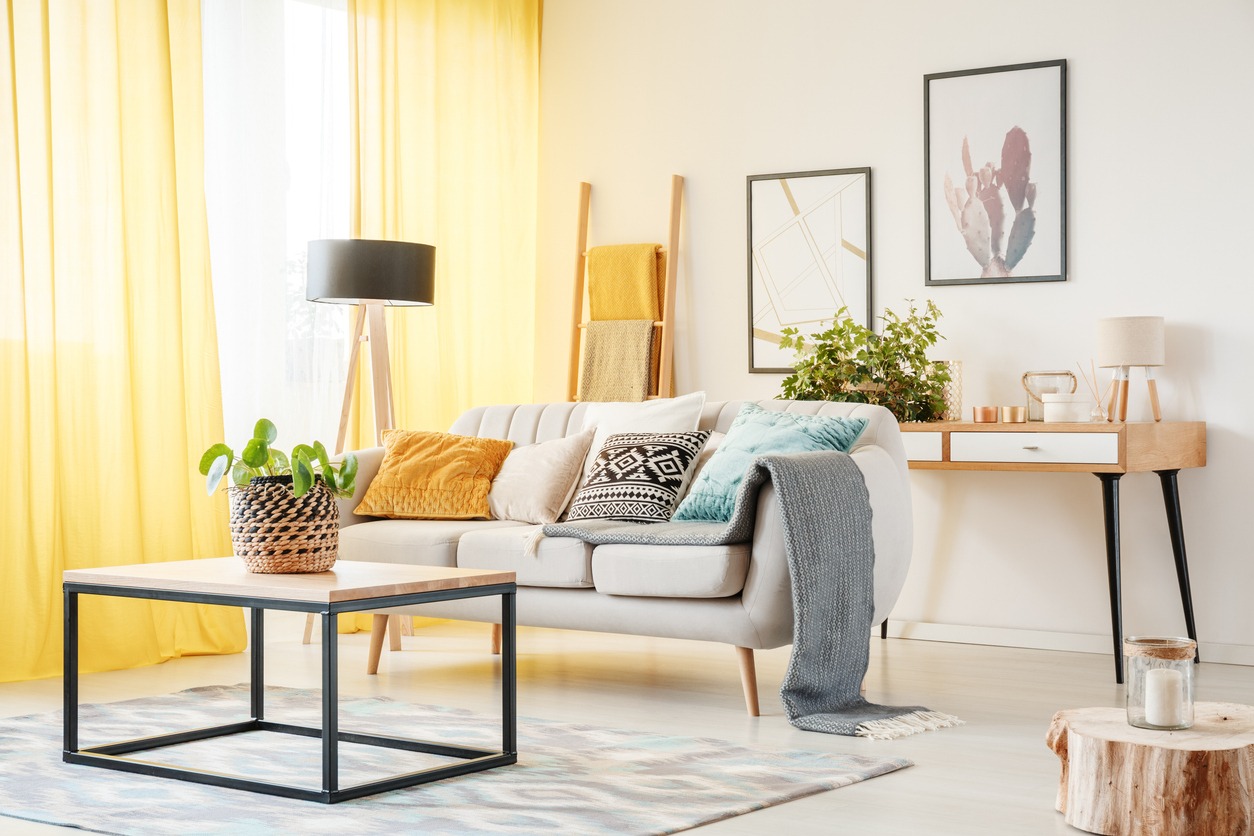
Bold accents
Using pops of color for visual interest
- Doors and trims: Bold colors introduced through doors, window trims, or balcony railings add character without overwhelming the space. Popular choices include deep navy blues, charcoal blacks, or vibrant reds, which create focal points while allowing the rest of the space to remain neutral.
- Accent walls: An accent wall in a common area, living room, or bedroom can be a stylish way to introduce more color without committing to an entire room. Jewel tones like emerald green, sapphire blue, or deep plum can make a space rich and inviting.
- Balconies and outdoor spaces: For balconies, bold colors like turquoise, coral, or mustard yellow can make these areas pop while giving a distinct identity to the exterior façade of the building.
- Balance: The key to using bold accents is moderation. By keeping the primary palette neutral and introducing color in smaller, concentrated areas, the space remains harmonious while feeling dynamic.
Color harmony
Selecting complementary colors for a cohesive look
- Adjacent rooms: When choosing colors for an entire condo or apartment, consider how rooms flow into one another. Using different shades of the same color or choosing colors adjacent to the color wheel helps maintain harmony between spaces. For example, light gray in the living room could transition smoothly into a deeper charcoal gray in the bedroom.
- Monochromatic schemes: A monochromatic palette, where different tones of a single color are used, can create a serene and cohesive look. For instance, using various shades of beige or gray throughout the apartment offers continuity and visual comfort.
- Balance of warm and cool: Mixing warm and cool tones can help create a balanced and inviting environment. A cool neutral, such as soft gray paired with a warm beige or taupe, can make the space refreshing and cozy.
- Textural elements: Incorporating different textures within a neutral or harmonious color scheme can prevent the space from feeling flat. Textures like natural wood, stone, metal, or plush fabrics add depth and interest without disrupting the color flow.
Tailoring colors for specific audiences
When tailoring color schemes for specific audiences, understanding their lifestyle and preferences is crucial:
- Luxury condominiums: Choose darker, more sophisticated palettes like deep grays, navy blues, or charcoal to convey a sense of exclusivity and refinement. You can pair these tones with metallic accents for a luxe finish, thus creating an upscale, modern ambiance.
- Urban apartments: Use modern, energetic colors such as bold blues, vibrant yellows, and cool neutrals like light gray or white. These colors reflect the dynamic, fast-paced lifestyle of city living and offer a contemporary and youthful aesthetic.
- Family-friendly complexes: Choose warm, inviting tones like soft beige, light taupe, or pastel hues that evoke comfort and coziness. These colors help create a welcoming, safe environment that appeals to families, fostering a sense of home and warmth.
The role of finish in commercial painting
Matte vs. gloss
- Matte: This type of finish provides a soft, non-reflective finish, ideal for hiding imperfections. It is aesthetically pleasing but harder to clean, making it less suitable for high-traffic areas.
- Gloss: This finish is highly reflective, giving surfaces a sleek, polished look. It is easier to clean, but it highlights imperfections, so surface prep is crucial.
Textured finishes
- Textured finishes add dimension to flat colors, creating visual interest and depth. They can also help mask surface flaws, making them a great option for exterior façades or accent walls in commercial spaces.
Anti-graffiti and UV-resistant coatings
- Anti-graffiti coatings protect surfaces from vandalism by making graffiti easier to remove. UV-resistant coatings prevent fading and degradation due to sunlight, extending the lifespan of exterior paint in urban or sunny environments.
Collaborating with professionals
Collaborating with paint professionals for apartments and condominiums offers several advantages:
The value of expert input
Commercial painters bring experience in selecting the right products and techniques for high-traffic areas. Their input ensures that surfaces are properly prepared and that durable, high-quality paints are used, contributing to the longevity of the finish. They also ensure compliance with regulations or warranties that may apply to multifamily housing projects.
Custom color matching
Professionals can use specialized tools and resources to match custom colors to meet branding guidelines or design visions. They can also advise on coordinating colors to create a cohesive, polished look across multiple units or common areas.
The painting process
A professional approach involves thorough surface preparation (e.g., cleaning, patching, sanding), priming to ensure even application and adherence, and applying paint in layers for a smooth, lasting finish. They also use techniques like spraying, rolling, or brushing based on the surface for the best outcome.
Conclusion
Making thoughtful, informed color choices for condominiums and apartment buildings can help enhance aesthetics, functionality, and value. Well-chosen colors create a welcoming, cohesive look, improving curb appeal and attracting potential buyers or renters.
Functional color schemes can influence how spaces are perceived—lighter tones can make small areas feel larger, while strategic accents can add visual interest. Additionally, a carefully planned palette can reflect the building’s identity and ensure it remains appealing and timeless, contributing to long-term property value.
Property managers and developers should partner with experienced commercial painters, such as Custom Painting, Inc., to ensure successful outcomes. Custom Painting, Inc. brings expertise in selecting durable, appealing color schemes and applying finishes that enhance the building’s aesthetics, functionality, and longevity. Call us at 925-294-8062 or message us on our contact page.