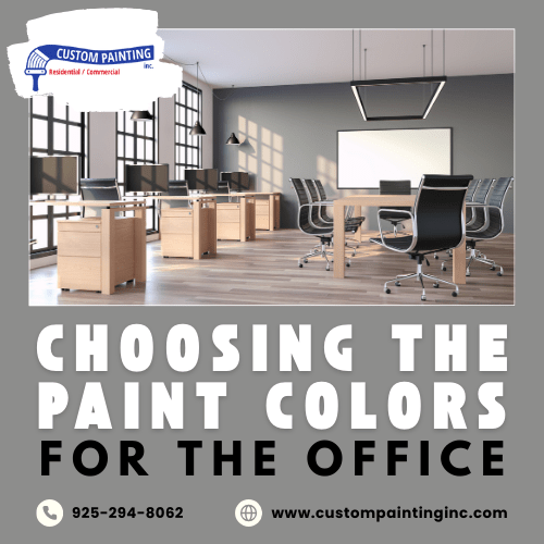
Choosing the right colors for your office space is far from being a piece of cake. You don’t want a stark white office that feels cold and clinical, but you also want to avoid loud colors that are too distracting and don’t look professional.
Office environments significantly impact productivity and well-being, influencing employee focus, creativity, and stress levels. The right paint colors create an atmosphere that fosters motivation and comfort.
Colors affect mood, productivity, and morale; for example, blue tones can enhance focus and calmness, while warm hues like yellow and orange stimulate creativity and energy. Thoughtful color choices can create a positive, balanced environment that boosts individual performance and overall workplace satisfaction.
Understanding color psychology in the workplace
Color psychology studies how different colors influence emotions and behavior, making it essential for workplace design. Each color has distinct psychological impacts:
- Blue promotes calmness, focus, and productivity, making it ideal for detail-oriented tasks.
- Green creates a sense of balance and reduces eye strain, making it perfect for long work hours.
- Yellow encourages creativity and energy but can feel overwhelming in excess.
- Gray and neutral tones offer a professional, modern, and versatile backdrop, adaptable to various spaces.
- Red stimulates energy but should be used sparingly, as it can also induce stress.
The type of work plays a critical role in choosing colors—creative roles may benefit from stimulating hues, while focused tasks might require calming tones for enhanced concentration.
Tailoring colors to office spaces
When tailoring colors to office spaces, consider the purpose and energy of each area:
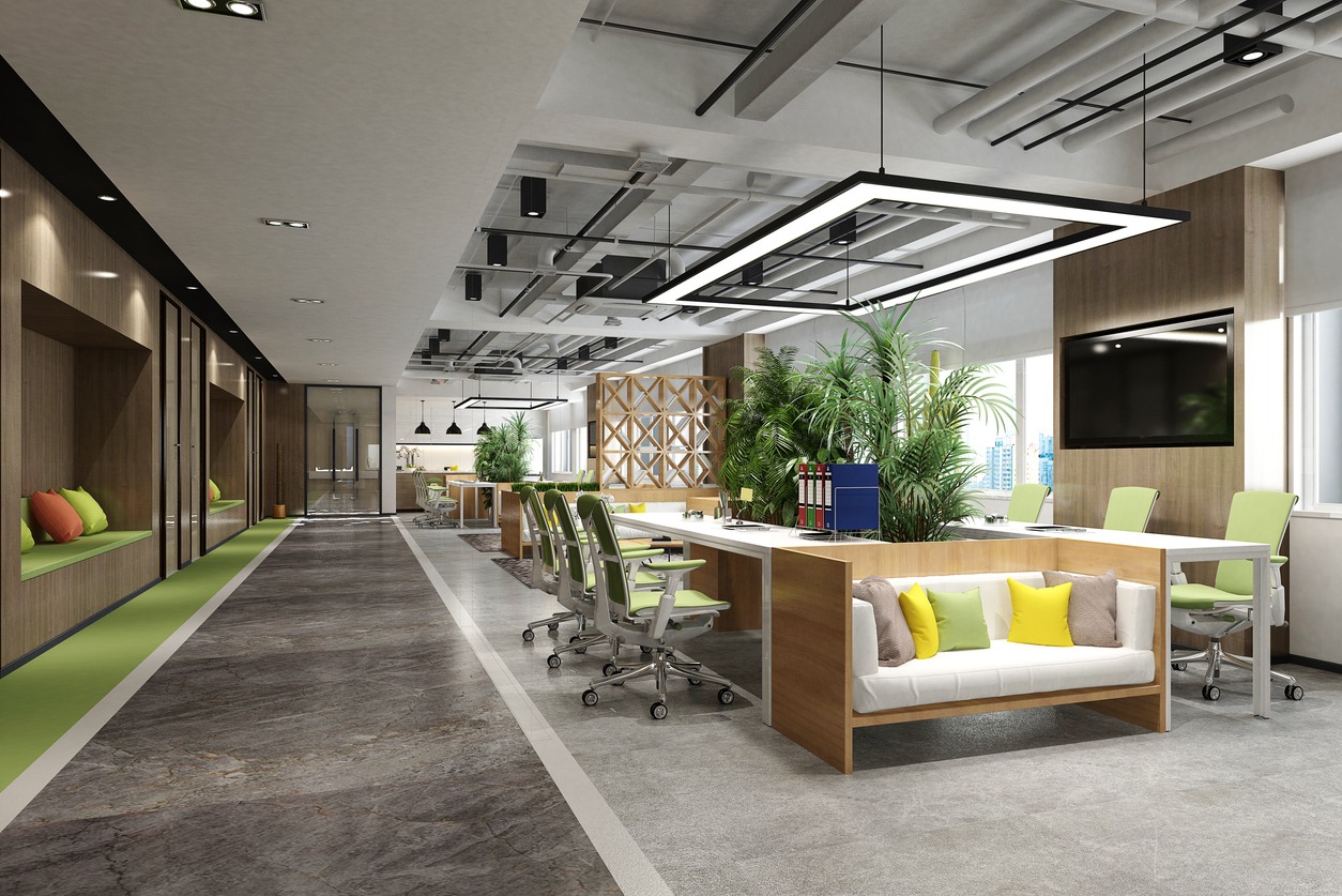
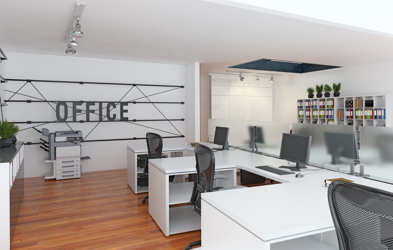
- Open workspaces: Lighter, neutral tones like whites, beiges, or light grays help maintain focus, reduce distractions, and encourage collaboration among team members.
- Private offices: Customize colors to the occupant’s role. Blues can convey calm and authority suitable for executives, while greens can foster creativity for directors or designers.
- Meeting rooms: Subtle oranges or greens can boost energy and promote collaboration, helping to inspire dynamic discussions.
- Break rooms and lounges: Warm tones like soft yellows or muted pastels create a relaxing atmosphere for employees to unwind and recharge.
- Reception and waiting areas: Calming, inviting colors such as soft blues or grays make a positive first impression and set a welcoming tone for visitors and clients.
Considering natural and artificial lighting
When choosing office paint colors, lighting plays a crucial role in how those colors appear:
- Role of lighting: Both natural and artificial lighting influence how paint colors look. A color that seems vibrant under natural light can appear dull or muted in artificial light, and vice versa. The direction and intensity of the light source also impact how a color is perceived.
- Natural vs. artificial light: Natural light tends to bring out a paint color’s genuine tone, but the effect varies depending on the time of day and the angle of sunlight. In contrast, artificial lighting—especially incandescent, fluorescent, or LED—can add warm or cool undertones, changing how the color is perceived. For instance, fluorescent lighting may enhance cooler tones, while incandescent lighting can make colors appear warmer.
- Testing colors: To ensure the best choice, test paint samples in the office space by applying small patches on walls and observing them throughout the day under natural and artificial lighting. Evaluate how the color changes at different times to avoid surprises after completing the paint job.
This approach ensures your office colors remain consistent and appealing under all lighting conditions.
Aligning paint colors with branding
Aligning office paint colors with a company’s branding reinforces brand identity and creates a cohesive environment for employees and clients.
1. Importance of matching paint colors with the brand: The colors in an office should reflect the company’s core values, vision, and personality. It enhances brand recognition, creates a professional atmosphere, and can even influence employee morale and productivity by aligning the workspace with the company’s culture.
2. Tasteful integration of brand colors: Using brand colors doesn’t mean painting every wall in bold hues. Accent walls, trims, or furniture in brand colors can add subtle touches without overwhelming the space. Balance is essential—neutral tones can complement the more vibrant brand colors, ensuring the space remains welcoming and comfortable.
3. Case examples:
- Google integrates its iconic primary colors in a fun yet balanced way, using accent walls and furniture to reflect its playful and innovative brand while maintaining open, neutral spaces for focus.
- Airbnb uses soft shades of its brand color palette to create a welcoming and home-like atmosphere, which aligns with its service philosophy.
Choosing the right finish
When choosing the right finish for an office, consider both aesthetics and durability:
- Matte has a non-reflective surface, ideal for hiding wall imperfections. However, it is less durable and more challenging to clean, making it better for low-traffic areas like private offices.
- Eggshell is slightly more durable than matte with a soft sheen, making it suitable for conference rooms or areas with moderate traffic. It balances appearance and ease of cleaning.
- Satin offers more sheen and durability, ideal for high-traffic areas like hallways or shared spaces. It is easy to clean, making it a practical choice for busy offices.
- Gloss and semi-gloss finishes are highly durable and reflective, perfect for doors, trim, and high-traffic areas prone to smudges and wear. Semi-gloss is often used in breakrooms or kitchens.
Durability concerns: The right finish affects longevity. Higher-sheen finishes like satin, semi-gloss, or gloss withstand frequent cleaning and wear, while matte and eggshell may require more frequent touch-ups in busy environments. Choosing the correct finish extends the paint job’s life, reducing long-term maintenance.
Creating zones with color
Using color to define different areas within an office helps visually organize the space, support specific activities, and enhance productivity. Here’s how it works:
- Creative spaces: Bright, energizing colors like orange, yellow, or bold greens can stimulate creativity and innovation.
- Quiet zones: Softer, muted tones like pale blues, soft grays, or light greens create a calm, focused environment ideal for concentration and quiet work.
- Collaborative zones: Warm, inviting colors like reds, burnt oranges, or deep blues encourage interaction and teamwork.
Practical examples:
- Use a vibrant accent wall in collaborative spaces for energy while keeping adjoining areas neutral.
- Use several shades of the same color to create subtle distinctions between areas without overwhelming the space.
- Color-code furniture or wall sections to designate informal breakout zones.
Cohesive transitions: Smooth transitions between different areas are essential for maintaining visual harmony. Use complementary colors or gradient effects to subtly shift from one zone to another without stark contrast, ensuring the entire office remains cohesive and balanced.
Trends in office colors
Overview of current office color trends
- Biophilic design: Incorporating natural elements, greens, and earthy tones favored for creating a calming and nature-inspired environment. This trend promotes wellness, reduces stress, and boosts creativity.
- Minimalistic whites: Clean, bright white walls remain a favorite for modern, sleek designs. They offer a sense of openness and simplicity. This trend is versatile and works well with various décor styles.
- Muted blues: Muted blues are favored for their calming, focused effect, making them ideal for offices where concentration and a serene environment are important.
Why certain trends work better in different industries
- Tech offices: These often embrace vibrant, creative color schemes like bold blues, greens, or even energizing oranges to foster innovation and energy.
- Corporate offices: More traditional corporate environments lean towards neutral tones like grays, whites, or muted blues to promote professionalism, focus, and a calming atmosphere.
Balancing trends with timeless design
To future-proof office spaces, choose timeless base colors (neutrals or soft tones) and incorporate trendy colors through accents like furniture, artwork, or accessories. It allows easy updates as trends evolve without significant renovations.
Consulting a professional painter
- Ensures best results: Working with a professional painter guarantees a high-quality finish and application. They have the skills to handle complex projects and can save time and effort, ensuring your office looks polished and inviting.
- Expertise in color selection: Professional painters possess in-depth knowledge of color theory, including undertones, lighting effects, and how colors interact in a space. They can help you choose colors that enhance your office’s mood, productivity, and branding.
- Effective communication: To communicate your office’s vision, be clear about your goals, the atmosphere you want to create, and any branding elements to consider. Providing visual references, such as color swatches or images of desired styles, can help the painter better understand your needs.
Conclusion
Choosing the right paint colors for the office is crucial, as it can significantly influence employee productivity, morale, and the overall atmosphere of the workspace.
By carefully selecting colors that align with the company’s branding and promote a positive work environment, business owners and office managers can create a space that fosters creativity and collaboration. We encourage you to invest time and thought into this crucial decision for long-term benefits.
Contact us for expert advice and professional office painting services! Bring your office space to life. Call our team at 925-294-8062 or message us on our contact page to schedule your office makeover. We bring the expertise, craftsmanship, and quality you deserve.