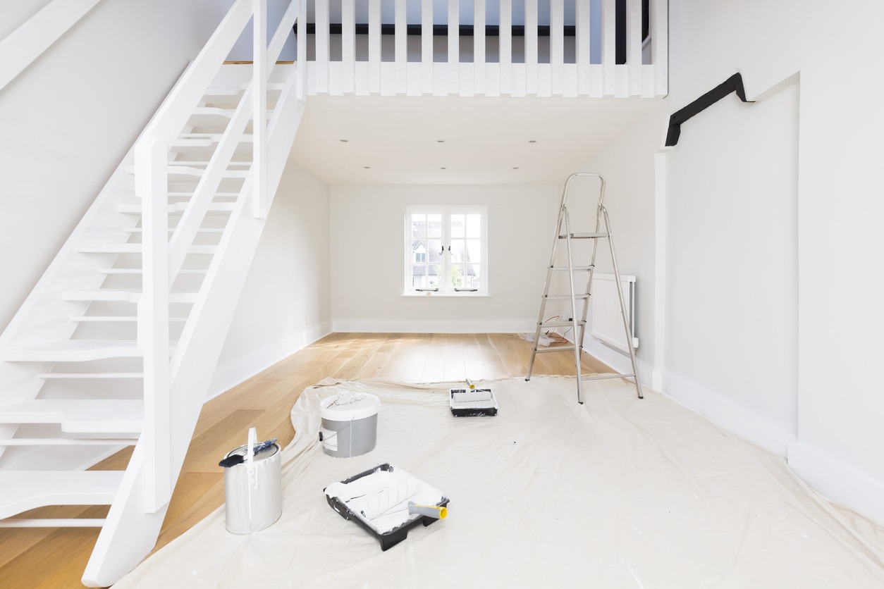
Here at Custom Painting, Inc., we can help refresh your home through our expert residential interior painting services. With years of experience, we’re committed to high-quality workmanship. Whether you are updating a single room or transforming your whole house, we are here to help.
Our goal is to create a space you are excited to live in. We ensure every detail reflects your style and meets your needs. That’s why we’re here for you, from choosing the right colors to the final brush stroke. Read on to learn more about our services. Discover why many homeowners choose us for reliable and beautiful interior painting.
Benefits of Interior Painting for Homes
Here are the benefits that you can get from having your home’s interiors painted:
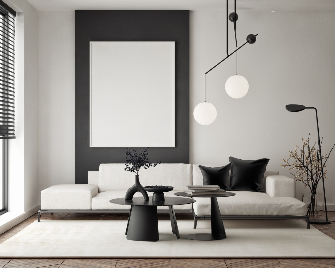
- Aesthetic Enhancement: A fresh coat of paint is one of the easiest ways to transform the look and feel of a room. New colors can revitalize old spaces and make them feel fresh and new.
- Increased Home Value: Painting your interior is a cost-effective renovation that can significantly increase your home’s market value. A well-maintained interior is attractive for potential buyers. It can make a great impression during showings.
- Personalization: Interior painting allows homeowners to express their personal style and taste. Whether you prefer bold, vibrant colors or subtle, soothing tones, painting makes it easy to customize your living environment.
- Protection for Interior Surfaces: Paint acts as an additional layer of protection for your walls. It shields them from everyday wear and tear. Quality paint can also prevent dust build-up and hide permanent marks or stains.
- Improved Indoor Air Quality: Modern paints come in low-VOC (volatile organic compounds) formulas. These reduce the emission of harmful chemicals, improving indoor air quality and ensuring a safer environment for your family.
- Mood Enhancement: Colors significantly impact the mood of a room. Choosing the right colors can create a calming, energizing, or welcoming atmosphere. This helps improve the overall comfort and livability of your home.
- Cost-Effective Maintenance: Painting is relatively inexpensive compared to other home improvement projects. Regular painting can also help avoid more extensive renovations by keeping walls in good condition.
How to Choose Interior Colors
Selecting the right interior paint color involves a systematic approach that considers your room’s unique environment and existing decor. A successful selection framework begins with evaluating lighting, as colors change dramatically under different conditions. Natural sunlight reveals a color’s true tone, while artificial lighting can introduce warm or cool undertones. To avoid surprises, always test swatches directly on the walls. Observe these samples at various times throughout the day and night to see how the shifting light affects the appearance.
Consider the room flow to ensure a cohesive transitions between connected spaces. While each room can have its own personality, maintaining a consistent palette helps the home feel unified. Additionally, your existing furniture and textiles should guide your choice. Rather than selecting a paint color in isolation, pick a shade that complements your largest investment pieces, such as sofas or rugs. By anchoring your color choice to these fixed elements and verifying the hue with large-scale tests, you can create a professional and harmonious interior design.
Residential Interior Painting Services We Offer
Custom Painting, Inc. has a wide range of interior painting services for different needs and preferences. Here are some of them:
- Whole Home Painting: This service is ideal for new homeowners or those looking to revamp their living spaces completely. We can cover every room to give your home a cohesive and polished look.
- Room-Specific Painting: This service is perfect if you need a change but are not yet ready to have the entire home painted. Whether you want to brighten up your living room, add elegance to your dining area, or create a relaxing bedroom, we are here to help.
- Ceiling and Trim Painting: Our ceiling and trim painting can give your rooms a finished and luxurious feel. We ensure these often-overlooked areas are painted with precision to enhance the overall aesthetic of your spaces.
- Color Consultation: Choosing the right colors can be challenging. Our color experts are here to help you select the perfect palette that reflects your style and works best for your home’s lighting and dimensions.
- Custom Textures and Finishes: We offer custom textures and finishes for those who want to add a unique touch or architectural interest to their walls. We can create a look that is uniquely yours, from subtle texturing to artistic effects.
- Cabinet Painting: We can also help you transform your kitchen or bathroom with our cabinet painting services. This is a great way to update your space without the cost and hassle of a full remodel.
Our Process
We believe in a clear and constructed approach to interior painting. This can ensure you high-quality results and a smooth experience. Here’s how we do it:
- Initial Consultation: During the initial consultation, we’ll discuss your vision, budget, and timeline. We can also provide you with a free estimate based on the areas to be painted and the types of paints and finishes you prefer.
- Color Selection and Design: Our color consultants will help you choose the best colors for your home. We consider factors like lighting, space dimensions, and your home’s exterior décor. This ensures the final result matches your personal style and each room’s functionality.
- Preparation Work: Proper preparation is needed to achieve flawless results. We take care to protect your furniture and flooring. We also prepare walls by filling holes, sanding surfaces, and applying primer as needed. This ensures a smooth and durable finish.
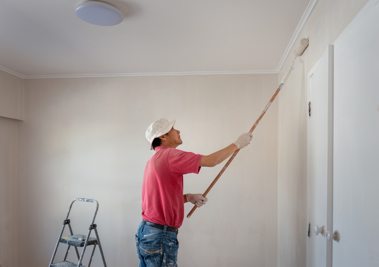
- Painting: We apply high-quality paint using the best techniques for the texture of your walls and your chosen paint. We are meticulous about achieving even coverage and clean lines.
- Clean–Up: After the painting is complete, we conduct a thorough clean-up of the work area. We remove all materials and ensure your space is left neat and tidy.
- Final Walkthrough: The final step in our process is a walkthrough with you to make sure you are satisfied with our work. We will ask for your feedback and address any touch-ups or concerns you may have.
- Follow–Up: We also provide a follow-up call a few days after completing the project. We do this to make sure everything is perfect, and you are completely happy with the outcome of our work.
Why Choose Us?
We set ourselves apart with our commitment to quality, customer satisfaction, and professional integrity. Here’s why you should choose Custom Painting, Inc. for your interior painting needs:
- Experienced Professionals: Our team consists of highly skilled painters with years of experience in the industry. We are knowledgeable about the latest techniques and trends. This ensures that every job is done to the highest standards.
- Quality Materials: We use only the best paints and materials available on the market. This commitment to quality ensures that our finishes are not only beautiful but also durable and long-lasting.
- Attention to Detail: We pride ourselves on our meticulous attention to detail. From precise edges to uniform coverage, our workmanship is flawless, ensuring perfect results.
- Customer-Centric Service: We prioritize clear communication, respect your space, and tailor our services to your specific needs and preferences.
- Timely Completion: We respect your time and strive to complete projects on schedule and with minimal disruption to your daily life. Our efficient processes and effective project management ensure timely completion without compromising on quality.
- Competitive Pricing: We provide detailed and transparent quotes that ensure you understand what you are paying for, with no hidden costs.
- Fully Licensed and Insured: Our business is fully licensed and insured. This provides you with peace of mind, knowing that you are working with professionals who are covered in all aspects of the job.
- Satisfaction Guarantee: We stand behind our work with a satisfaction guarantee. If you’re not completely happy with the results, we’ll work tirelessly until you are. Your satisfaction is our top priority.
Contact Us!
If you’re looking to refresh your space with vibrant new colors and a professional finish, look no further. Custom Painting, Inc. is here to help bring your vision to life. Contact us today to schedule a free consultation and receive a detailed estimate tailored to your specific needs.
You may call us at 925-294-8062 to discuss your project with one of our expert painters. You can also fill out our contact form to get started immediately. We’re excited to work with you and show you how our skilled team can enhance the beauty and comfort of your home.