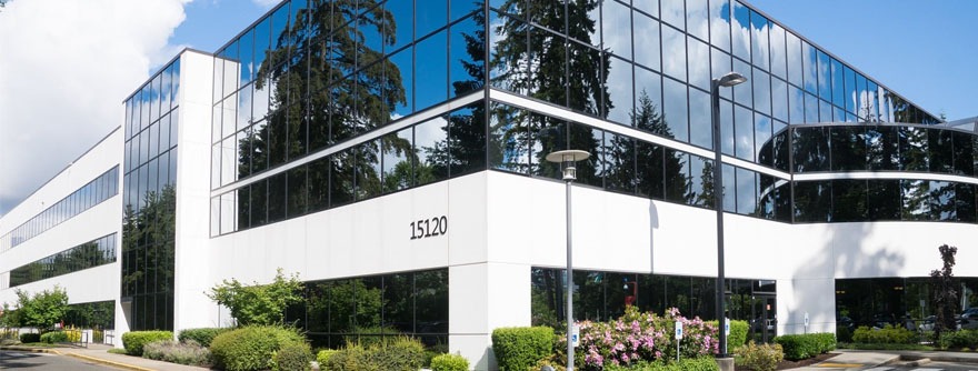
Turn to a Custom Painting, Inc. if you need to have your commercial property finished. We are licensed, carry $4,000,000.00 liability insurance, and are bonded. Our team includes both carpenters and full-time professional painters.
We are able to serve your painting needs for both interior and exterior work as well as installing custom trim. We will take jobs of any size – no job is too small or too big. We will provide you with as many references as you would like to enable you to choose the right painting contractor. We provide painting services for the greater Bay Area. This includes Danville, Walnut Creek, Pleasanton, Pleasant Hill, Concord, or Dublin, CA as well as those in the East Bay.
We offer these tips in case you have decided you would like to have your commercial business repainted:
- Go outdoors and review the exterior of your business. If you see damaged or peeling paint, your customers probably see it, too. This can detract from your business’ curb appeal. A fresh coat of paint will alleviate the problems associated with peeling or chipping paint damage. It will also improve how your exterior looks.
- Take a walk around the inside of the building. Do you see scratched, scuffed, or other damage to the walls? Perhaps you would like to give your interior a more modern look. Custom Painting, Inc. has the experience to improve your building’s interior.
- Be sure to consider the impact painting will have on your customers. You want to plan so that it will have the least negative impact on them. Choosing the right painting company in Danville, or any city in the Bay Area, will work with your schedule so your business can continue and they can get the painting done.
- Whether you decide to paint the interior, the exterior, or both, decide how much you can budget for the work to be done. It is likely there is a line item for business improvements. You may want to consider using this line item at this time.


Investing in the way your business looks can have an impact on your customers. This could include how they feel about your business and the amount of money they spend while they are there. Contact our office at 925-294-8062 to schedule a time for our estimator to visit your business.
We are easy to work with and are fully trained to work around clients if that is needed. Or, if it would be better for us to work on Saturdays, we are willing to meet your schedule so you don’t lose business and make the process an easy one for you. You may reach us by going to our Contact page on our website and filling out the form to request an appointment and receive a free estimate or you may call us at 925-294-8062.